Cracker Barrel Rebrand: Reblanding Meets the Rocking Chair
What happens when brand simplification collides with ritual and trust

Cracker Barrel tried to do what every brand is told to do in 2025: simplify, modernize, “clean it up.” You know the move. Flatten the mark. Lose the fussy stuff. Make it work at 32 pixels.
Reblanding.
And then their customers lit the porch on fire.
Cracker Barrel didn’t just catch flak — it reversed the logo change within about a week, publicly stating the new logo was going away and the “Old Timer” would remain.
This is the reblanding trend colliding with a brand whose entire value proposition is: nothing changes.
What “Reblanding” Actually Is
Reblanding isn’t really “rebranding.” It’s brand simplification as an operating system update:
legible on apps and delivery platforms
consistent across packaging, menus, uniforms, signage
easier to animate, easier to reproduce, easier to manage
fewer bespoke assets, fewer edge cases
It’s not inherently dumb. It’s often rational.
The problem is: rational isn’t the same as wise when your brand equity lives in a specific, beloved symbol.
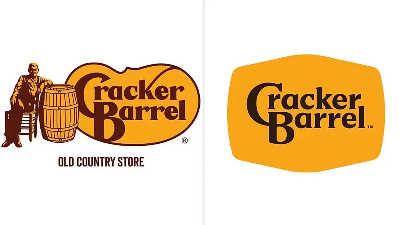
What Cracker Barrel Changed (and why it triggered backlash)
Cracker Barrel’s short-lived logo redesign removed the illustrated “Old Timer” figure and leaned into a simplified wordmark look.
The company’s stated logic was practical: the simplified mark would be more visible and readable — including on highway signage — and more functional across modern surfaces.
That logic is fine.
But it ignores the central truth of Cracker Barrel’s brand:
The logo isn’t decoration. It’s a promise.
That figure and that “Old Country Store” vibe aren’t a style choice. They’re the psychological receipt that says:
“This is still the same place you remember.”
So the moment you remove it, customers don’t think “modern.”
They think “they’re about to change everything.”
Which is exactly what the interior remodel experiments signaled to people — and Cracker Barrel ended up suspending remodeling plans in the wake of the backlash.
Where They Really Went Wrong: Silence and Surprise
The biggest mistake wasn’t the logo.
It was how it was introduced.
Cracker Barrel didn’t frame the change.
They didn’t socialize it.
They didn’t bring loyal customers along for the ride.
The new logo was rolled out quietly, almost incidentally — mentioned deep in a press release about menu updates. No explanation. No narrative. No reassurance about what wasn’t changing.
So customers didn’t encounter a thoughtful evolution.
They encountered a screenshot.
In a vacuum.
And when you introduce change without context, people fill in the blanks themselves — usually with fear.
Had Cracker Barrel done even a minimal amount of audience engagement, this might have played out differently:
A heads-up to loyalty members
A “why now” blog post
Side-by-side visuals showing continuity
Explicit reassurance that the Old Country Store vibe wasn’t going anywhere
Instead, the brand went from familiar to unexplained overnight.
For a nostalgia brand, that’s fatal.
People didn’t reject the logo because it was simplified.
They rejected it because it arrived without consent.
Reblanding relies on trust. Cracker Barrel skipped the trust-building step.
And when the new logo appeared as an afterthought in a press release about menu updates, the brand ceded the narrative entirely. No framing. No context. Just a screenshot and a sinking feeling.
The Backlash Wasn’t Just Online Noise
This is what makes Cracker Barrel a real case study instead of a design-food fight:
Reuters reported customer traffic fell roughly 8% after the rollout window referenced, and shares were down materially from the initial announcement point; they also reported the company abandoned planned remodels and reverted pilot stores back toward the classic look.
The reversal itself was publicly confirmed, widely covered, and fast.
So yes: this wasn’t “Twitter was mad.” This was “your core audience interpreted the change as betrayal, and the company chose not to test how far that goes.”
Why This One Snapped Back So Fast
Cracker Barrel sells comfort-through-consistency. That’s not a metaphor. It’s the business model.
In a previous post, I talked about how Jaguar can afford to polarize because it’s trying to replace its customer story (EV luxury reinvention) and is willing to endure hate if it buys attention and a new audience.
Cracker Barrel can’t.
When your brand is ritual, you don’t get to play “surprise identity reset.” Reblanding works best when the brand’s meaning lives in product performance or innovation (Kia, VW). It backfires when the meaning lives in a symbol people are emotionally bonded to (Tropicana, Gap, Cracker Barrel).
Cracker Barrel is in the Tropicana club:
remove the iconic asset
customers can’t find “the same thing” anymore
they revolt
you put it back
The Real Lesson: Don’t Move the Trust Anchor
Reblanding is fine until it touches the one element that acts as the brand’s trust anchor.
For Cracker Barrel, the trust anchor is not just rocking chairs and antiques.
It’s the implication that the whole place is a time capsule you can reliably re-enter.
The simplified logo broke that spell.
So Cracker Barrel did the only rational thing for a nostalgia brand:
they reverted — quickly — and lived to modernize another day, more carefully.
Cracker Barrel didn’t lose a logo fight — it ran an experiment and discovered something useful:
You can modernize operations. You can modernize menus. You can even modernize interiors.
But if you modernize the symbol that tells people the brand hasn’t changed, you’re not rebranding.
You’re breaking the contract.
And nostalgia brands don’t survive contract breaches.